Difference between revisions of "Conservapedia:Logo"
(→How about a Conservapedia mascot?) |
(english) |
||
| Line 9: | Line 9: | ||
== Conservapedia Logo == | == Conservapedia Logo == | ||
| + | |||
| + | [https://commons.wikimedia.org/wiki/File:Proposed_Conservapedia_logo.svg Logo] | ||
| + | |||
| + | *Will fix if popular | ||
:[[Image:Logoss.png|left]] | :[[Image:Logoss.png|left]] | ||
Latest revision as of 23:47, August 29, 2019
Contents
Before Making Your Own Logo Read This
The "rules" for creating the logo are as follows:
- The logo has to be 135 x 135 pixels
- The logo cannot utilize a globe as this would be far too close to Wikipedia's logo
- The logo needs to "blend" well with the rest of the site (this is more of a good thing than a rule but your logo will probably not be used if it does not)
- It would be best for any "background" sections of the photo to be transparent
Conservapedia Logo
- Will fix if popular
- Also, I meant to ask you about the logo yesterday and completely forgot. I have fooled around making a couple logos but am not very happy with the results. I am assuming the colors should be blue, white and other neutral colors or maybe red (to match the featured aritcle and news headers). Let me know if you have a particular color scheme in mind. I'm also trying to decide what the logo should be based up, a cross or the letter C for example. So if you have any imput or ideas on this topic let me know. Sorry about this being so long!--SharonS 14:01, 5 January 2007 (EST)
- Reply: I don't have any particular color scheme in mind. However, the colors of the logo need to blend well with the rest of the site. Post anything you have on here and we can improve them. Also, I came up with the logo below but Mr. Schlafly and I both agree that it is a little too republican. Even so, the colors and the "dullness" of this image are sortof what we are looking for.
- We are not the house Wiki of the Republican Party of the United States.
- As a corollary to the above, the Republican Party owns that image and we have no right to use it.
- Many who call themselves "Republicans" are not conservative by any reasonable definition of the word.
- Many conservatives have abandoned the Republican Party in favor of a third party. Shall we, then, leave them out?--TerryH 21:15, 5 March 2007 (EST)
- Here is my favorite one:
- There is something weird about it, but I can't quite tell what it is. Also, it doesn't say Conservapedia on it, but I can change that if you want me to. Please critique it, and I will improve it with your suggestions.
- Thank you!
- --SharonS 16:01, 5 January 2007 (EST)
- PS: It doesn't really have that white background. It is supposed to be just the circle. Sharon
- Here is my logo suggestion. I borrowed the C from sharon.
- Good work Ben! I have two comments about your logo: This may just be me, but the ovals sort of look like orbits of electrons around the nucleus in the bohr model of the atom, implying that Conservapedia is a scientific encyclopedia, while we really have content on all topics. The image looks a little "digital", meaning you can see the pixels creating that jagged look around the edges of the letters and lines. You might be able to fix this by adjusting your program to make higher quality images with more pixels.--SharonS 17:56, 5 January 2007 (EST)
- Ben, it looks like Saturn. -Sarah
- Thank you sharon, I agree on the first point; my original intention was to place the "Conservapedia" on top of one of those oval maps of the world. i could't do this because the only artistic medium i have on my comuter is paintbrush. That is also the reason why it looks "digital". Ben
- Wow Sharon, that was deep :)
- Ben, I like your idea about putting "Conservapedia" on top of a world map. I started to mess around with it a little and like the results so far. I will post it on here once it is presentable.--SharonS 22:39, 6 January 2007 (EST)

- Jessica, your logo is nice. I would suggest that you give the letters a little more room at the edges. Also, you might try cropping it to a square with rounded corners. Here is what I came up with based on Ben's excellent idea:
 As I said before, I really like this one. Thank you for the great idea Ben! Let me know what you think of it.--SharonS 16:24, 7 January 2007 (EST)
I think the background earth is too vivid, it should be maybe light blue and green.--TimSvendsen 16:49, 7 January 2007 (EST)
OK. I'll do that in a minute. Sharon
I really don't like either of the two "globe" logos. We are an AMERICAN encyclopedia. If you want to put something behind the logo put a map of America. Also, Wikipedia uses a globe, we don't want something so similar... definitely no globe PhilipB 16:56, 7 January 2007 (EST)
True, the globe thing is a little to close to Wikipedia's logo. My next one will be "Conservapedia" over a blue and green map of America. ~ Sharon
Actually, now that I think of it, although we do favor the American spelling of words, we have contributors from all around the world. Just something to think about. ~ Sharie
I noticed something interesting about Wikipedia's logo. It reflects their mission statement "the encyclopedia anyone can edit" it the way it has a missing puzzle piece. I wonder if we could come up with something that reflects "a conservative encyclopedia you can trust". If anyone has any ideas put them on here. ~ Sharie
REPLY: Yes, it is true that we favor American spellings for words and that we have contributors worldwide, but this is beside the point. Conservapedia is American, unlike Wikipedia which even though it is located in America, does not support America openly. It is very disappointing that this America-based website does not show its patriotism openly. Conservapedia will always show that it is proud to be American. PhilipB 17:26, 7 January 2007 (EST)
- I have mixed feelings on this issue. Yes, we do want to support America, but we also do not want to exclude other countries from Conservapedia. If I lived in Ireland or some other country and stumbled upon Conservapedia one day and saw a map of America on the logo, I would conclude that Conservapedia was an American encyclopedia, which is true. But, I think that the map of America would cause me to conclude that contributions from other countries were not wanted. We certainly do not want to exclude people from other countries in this way. --SharonS 07:28, 8 January 2007 (EST)
Comment I think that this particular logo (above) is the best so far.
As to the little debate you are having, I think that a globe is a very appropriate encyclopedia logo; we hope to have facts in our encyclopedia that relate to the entire world, not just America. The fact that we require american spellings does not mean we only want information about america. The logo should be a reflection of what type of information we offer.
--BenjaminS 09:53, 8 January 2007 (EST)
How about something like this
The background looks too dull along with that red color, which really hurts my eyes, but it will probably look much better after some color changes. ~ Sharon
That looks much better! The other map looked like goggles or something. ~ Sharon
These look pretty good Sharon. However, remember that we want the logo to "blend" well with the rest of the site. These logos would kind of clash with the other colors... if you know what I mean. Sorry for being so negative ;) PhilipB 17:28, 7 January 2007 (EST)
- Oh, those are actually Tim's. I just commented on them. I was instaling all my graphics designs software on this computer and am going to make some more logos tonight. Also, don't worry about being negative in your comments. If everyone tries to be nice all the time, nothing gets done. Since we are all friends, contructive criticism won't hurt anybody's feelings and will help us come out with a really excellent logo. ~ Sharie
Here is another logo in softer colors with soft edges. I also changed the fonts around a little, but can put them back the other way if you don't like these.
I know it still needs quite a bit of work so please critique it! --SharonS 07:54, 8 January 2007 (EST)
I changed my mind. The more I see, the less I like the idea of the logo being based on a map or globe. I think something made up of several different pieces that reflect our "mission," including things like a a cross, an american flag, a bible, etc. --TimSvendsen 10:21, 8 January 2007 (EST)
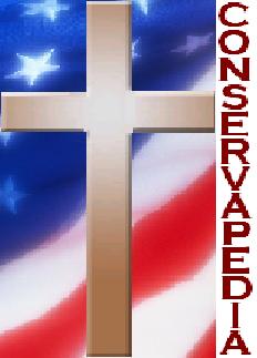
How about something like this:

I like it! Once again, the colors are a little too bright (on my monitor at any rate), but it is a good start. I really like the American flag in it. --SharonS 10:51, 8 January 2007 (EST)
I think that the bright colors are good. It may be a bit much when you see it big like that, but if it is small and in the corner of the screen it will help it be more noticable. You don't want the logo to blend so much that it "hides" in the corner. --TimSvendsen 11:07, 8 January 2007 (EST)
- I still like the other one better (see my last comment). If we do end up using this one, you need to make the "conservapedia" alot bigger. The caption will be almost illegible when this logo is small enough to fit in the corner.
--BenjaminS 11:15, 8 January 2007 (EST)
- P.s. I would further complain that the cross does is just plain brown and does not fit the picture; Maybe you should paste one on the flag that is slightly more detailed. also I don't like having the american flag at all; The logo, as I said before, should be a reflection of what type of information we offer.
I disagree: The logo should not reflect all of the information that we have to offer, but the difference between what we have to offer and what other people have to offer. It should reflect our point of view. Nobody is going to look at a logo and say "Oh look, an american flag, they must only have information about america." The logo reflects Christianity and Patriotism, not that we only have information about america and christianity. Even if we did want to do it your way the map would still be a bad idea because it implies geography. The logo I posted is just a concept, not a final product. it took me about 5 minutes. We would certainly want a more detailed cross, and bigger type.
--TimSvendsen 11:29, 8 January 2007 (EST)
I never thought about the world map implying geography. Interesting point. Maybe we are putting too much importance on the logo. Although it should look good and reflect the mission of Conservapedia, I wonder if visitors to the site are really going to give the logo much more than a quick glance. I for one don't ever really pay much attention to a site's logo. I think I am going to do something similar to what you did for my next logo. ~ Sharon
- Tim, I agree. Yes, we are getting pretty hung up on this issue. The facts are that we can't use a globe because it's way to close to Wikipedia's logo and that we'll always scare a small amount of people away depending on the logo we have. Even so, this should not intimidate us from placing what we are about in the logo. For now, let's just keep putting out ideas that don't incorporate a globe. PhilipB 11:48, 8 January 2007 (EST)
Tim, I took yours and edited it some. What do you think? PhilipB 14:15, 8 January 2007 (EST)

It is pretty good, I think that the color of the lettering needs to change, Dark Green maybe? --TimSvendsen 14:28, 8 January 2007 (EST)
- That looks good Philip. I think the whole thing is a little fuzzy. That's OK for the background, but the lettering needs to be nice and crisp. Tim, I don't think that dark green lettering fits with the color scheme of this logo. Here is my version of this logo:
Let me know what you think. Oh, and tell me if you want me to lay off the cross-in-C thing. Nobody commented on it so I just figured I'd keep using it, but if you don't like it please don't hesitate to tell me. I like this patriotic theme! It makes me think of the Fourth of July. :P ~ Sharon
Just Wondering Does the logo have to include the word conservapedia? --TimSvendsen 18:54, 8 January 2007 (EST)
Reply I don't think so, but I usually include it because the logo doesn't seem to look complete without it. ~ Sharon
I was thinking that we could keep the logo seperate from the word. That way we can have the word above it or next to it or something, or we could decide to not have the word anywhere near it. --TimSvendsen 23:00, 8 January 2007 (EST)
That would probably look better. I will see if I can come up with anything. --SharonS 07:03, 9 January 2007 (EST)
I should have mentioned this earlier, but the logo needs to be 135x135 pixels. PhilipB 09:14, 9 January 2007 (EST)
OK! ~ Sharon
How's This
--Chris 22:21, 15 January 2007 (EST)
- I think we have decided not to use a globe on our logo because it is too much like Wikipedia's logo. ~ SharonS 06:38, 16 January 2007 (EST)
- Yes, we did. PhilipB 10:03, 16 January 2007 (EST)
It's simple, but I think it is pretty cool. Tell me what you think....I can always modify it: slower, faster, different effect. David R
- David, that's pretty cool but I think that anything animated would be very distracting when someone is trying to edit/read content on the site. PhilipB 22:36, 18 January 2007 (EST)
- I agree. It was just an attempt at sparking a little creativity among all these crosses and globes. David R
- Um, just a quick point here: while using the Cross is nice, you're going to have problems with the conservative Jews that may wish to use the site. Perhaps we should find a completely new idea that doesn't make our fellow conservatives uncomfortable. --Katie 22:26, 18 January 2007 (EST)
- Well, considering the project is officialy Christian and conservative... I do however understand how such editors might feel more uncomfortable editing a project that used an avowedly Christian symbol. I'd be more concerned about the Church/State implications of such a symbol, but that might just be me. JoshuaZ 15:44, 1 March 2007 (EST)
There you go...135x135, mainly transparent, good color theme. Comments or suggestions would be appreciated. David R
- That looks really good! I didn't realize it was here until now, or I would have commented sooner. What does everyone else think? I think it looks good enough to use right away. ~ SharonS 14:25, 1 March 2007 (EST)
- I agree with Sharon, this is a good one. JoshuaZ 15:04, 1 March 2007 (EST)
I like it --BenjaminS 15:23, 1 March 2007 (EST)
- Great! As soon as Philip and Mr. Schlafly are back from economics, we can get their opinions. If they like, maybe Philip can figure out how to put it up for us! ~ SharonS 15:25, 1 March 2007 (EST)
As I said on the Talk page, I like it too. Dpbsmith 16:46, 1 March 2007 (EST)
I don't like it at all. Although the general idea is ok, it's not professional. Frankly, it looks like it was done on Paint. And the first thought that came to my mind when I saw it was the Fourth of July.
- Paint Shop Pro, thank you very much. :) What do you think would make it look more professional? --<<-David R->> 19:22, 1 March 2007 (EST)
- I'm not quite sure how David could make it any more "professional". I think it looks awesome now. Also, this is an American encyclopedia, so if the logo reminds you of the Fourth of July, that's a good thing. If there is a lot of controversy over using this logo, perhaps we can take a vote. ~ SharonS 19:30, 1 March 2007 (EST)
- Well, I could draw it a suit, tie, and tophat. Now that's professional! :P. But, seriously, this logo will be an image of what Conservapedia stands for. Any and all suggestions are welcomed. --<<-David R->> 19:42, 1 March 2007 (EST)
- WOW!!!! I just discovered this page. These logos are all fantastic!!!! Please pick and implement whatever you think is best! We can always improve it in the future.--Aschlafly 19:47, 1 March 2007 (EST)
- I'm a little concerned about transparency. You posted it as a .jpg and .jpg doesn't allow for transparency. I hope you did the original in a format like .gif or .png which does, and kept the original. If not, you may have lost the transparency for good, because not only does .jpg not have transparency, after you do the conversion to .jpg not all the "white" areas are actually pure white, so it's not easy to make them transparent again.
- I'm not sure the transparency is really all that important, though. One thing you might try is the effect adding a simple one-pixel black border, and see if that gives a crisper appearance against the greyish background. Just my $0.02.
- But really, it doesn't matter, just do something. Wikipedia's early logo didn't look as good as this one--at right is Wikipedia's logo circa 2002--and it can always be changed later. Dpbsmith 19:52, 1 March 2007 (EST)
- I agree, we can always change the logo easily in the future. There is really no excuse not to have one. David's latest logo has been approved by most of the regular users. If Philip thinks its alright too, then I think we should go ahead and use it! ~ SharonS 19:59, 1 March 2007 (EST)
- Yeah, I'd like to see how it looks as the logo. If it doesn't look good, then I can make the necessary adjustments or we can just scrap it and go down a different route. --<<-David R->> 20:03, 1 March 2007 (EST)
- I don't really like David's logo with the border. It seems to me that it boxes it in too much and prevents it from fading smoothly into the background. ~ SharonS 22:09, 1 March 2007 (EST)
- I just notices something about Dave's logo. If the flag is hanging (which it appears to be doing), shouldn't the stars be on the opposite side (the left side)? PhilipB 22:12, 1 March 2007 (EST)
- It could go either way. It just depends which side of the flag you're on. ~ SharonS 22:20, 1 March 2007 (EST)
I just submitted some more entries on my talk page. Let me know what you guys think about them. PhilipB 21:29, 1 March 2007 (EST)
It can be seen either way. Traditionally, it is seen the way I drew it...rotated 90 degrees clockwise, of course. If you would like it on the left, I can do that. --<<-David R->> 22:18, 1 March 2007 (EST)
- No, I am positive now that it can only be flown with the stars on the left. See this. Rule 14,8 esp. PhilipB 23:04, 1 March 2007 (EST)
- Ughh, Philip, getting so technical. Fine. Would you like me to switch it? --<<-David R->> 23:18, 1 March 2007 (EST)
This was just a hypothetical draft, if people like the colors/imagery then say and I'll develop it more. I'm happy to contribute --Gaijin 15:52, 6 March 2007 (EST)
My version

I used Windows Paint to do it in all of 12 minutes. Personally, I would keep the flag background, and transform the "C" logo into something more "crystalized", aka Windows Vista, and have it or both stand out in a 3-D effect. Karajou 23:46, 12 March 2007 (EDT)
I like it --TimSvendsen 00:02, 13 March 2007 (EDT)
Did the site that you retrieved the image from give specific permission for reproduction and alteration of the image in it's copyright statement? If not, it's probably illegal. And since I, like much of you lot here, am a Christian, albeit an Australian one, I shall refer you to Romans 13:1-7 for the bibles' policy on breaking the law. Dallas 01:08, 16 March 2007 (EDT)
Another one

Logo discussion from Talk:Main_Page
- Whatever you use as a logo, please don't use the Earth, since this website is not an accurate representation of global beliefs in any way, shape, or form. Using a cross and the U.S. flag, and maybe something like "4004 B.C." since half the site is about creationism, would be more accurate. --ALFa 01:16, 16 March 2007 (EDT)
How about a Conservapedia mascot?
How about a Conservapedia mascot? Does anyone have any suggestions? :) Conservative 19:00, 1 June 2012 (EDT)
- Speaking of which...brenden 19:14, 1 June 2012 (EDT)


